Friday, September 20, 2013

DIY Custom Logo Plaque

I am not only an aspiring architect, I am also an amateur designer, artist, and crafter. 

A couple weeks ago it was one of my closest friend, Allison's 25th birthday! Because I am on a budget, I wanted to make her something instead of buying something. Also making something ensures that it is unique and filled with love. I decided to create a plaque featuring the logo for her new business Party by Allison (she is a talented designer, entrepreneur, and event planning extraordinaire)


This is her logo (that she designed herself, she is so talented!)


This is the custom logo plaque I created for her (I think I got the final product pretty close to the original design!)


I am going to go through step by step instructions if anyone wants to try it for themselves. Of course if you would  want to do this plaque project, you would be personalizing this DIY by using your own logo or slogan or quote for this project, so make sure you have a reference to the inspiration of your plaque!


Supplies for this project:


- paint (I just used some paint I already had -for the background I used Ultra White - 70143 Valspar interior semi-gloss paint, for the texture, I used Warm Caramel - WGN17 Glidden interior eggshell / satin paint, and  for the lettering and outline I used Red Ochre - SA510 Master's Touch Acrylic paint, but you choose whatever colors suit your project)
- fine tip sharpie (I used this to outline some of the words that would need a more steady hand)
- pencil (to outline the image or words)
- paint brushes of various sizes
- reference image of whatever you want on the plaque (I just looked at it from my iPhone, but it can be printed so the image or words can be traced)
- wood plaque (this is the only supply I bought, I picked mine up at Michael's for $13.99, and with my 40% off one regular priced item coupon, it was only $8.40)


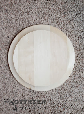
I picked out a round wood plaque (because her logo is round) but ther are may options of shapes and sizes that might work better for your DIY project.


First I painted two coats of the Ultra White paint and I sketched the logo onto the painted plaque with a pencil. If you aren't comfortable with free hand, then you can trace the image you want to paint.


Then I added some splotches of Warm Caramel color to refelct her logo, but also to add visual interest.


Next I painted the two outer rings Red Ochre and then the word "PARTY" also in Red Ochre. Then, I also added some more Warm Caramel to cover up some of my mistakes.


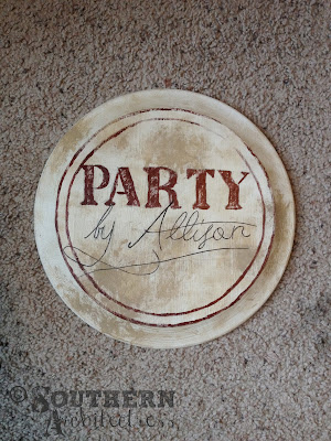
Finally, I drew the words "by Allison" in sharpie, because this was too delicate to use paint for. Finito!


I have made logo plaques like this in the past. For example: this one for the lovely Nicole Bell Photography (I don't have the process which I made it, and it has a few extra steps because it has an actual arrow attached to this plaque)


This is her logo (that Nicole designed herself, because she is a graphic designer, so duh!)


This is the final plaque (I don't have a step by step for this one... it includes some extra steps because of the 3D element of the arrow)


This is a photo of Ms. Nicole Bell modeling her custom plaque.
Visit her blog at http://nicolebellphotography.blogspot.com/
This photograph by Sarah Beth Photography


Eventually, I need to make a custom logo plaque with my new Southern Architectress blog logo!


Linked up to The Turquoise Home

Linked up to Not Just a Housewife

Linked up to Blissful and Domestic

Monday, September 16, 2013

My Favorite Architect

It might be strange to some people, but my favorite architect is actually a fictional character. Howard Roark, the protagonist in Ayn Rand's epic novel "The Fountainhead." In the second year of my undergraduate Architecture degree, one of my professors suggested that I read "The Fountainhead." It seems that a book which was written in 1943 wouldn't still be relevant today, but on the contrary, this timeless is still in print. It may seem like an over exaggeration, but this book was literally life changing for me. It inspired a lot of my passion while I was in school.

Roark is an idealist inspired by the real life architect, Frank Lloyd Wright. In the novel, Roark is kicked out of architecture school for his progressive ideas. He finds a job working for a washed up architet which he admires. After this architect's firm closes, he then gets hired at different firm as a favor from a former classmate. His new boss is the opposite of what he aspires to be and their personalitites clash and Roark is fired for defiance. This pushes him to open own firm, which one of my favorite moments in the book. When he looks at his name is on his door: Howard Roark, Architect; and he feels like he finally made it.

He doesn't have enough business to keep his firm open and he is forced to take a blue collar job at a quarry which is owned by his former boss. His dream of designing buildings is unrelenting. His clients eventually call him for more work and he is able to practice again. His designs are very unpopular with the public, which is easily swayed by the politics of the major newspaper.

The book was translated into an over the top, dramatic movie in 1949 which Gary Cooper portrays Roark. Fun fact: three of Wright's buildings are highlighted in the movie.

Roark's fatal flaw is that he is a relentless idealist who refuses to compromise his ideas. (I won't give away the plot twist at the end... but here is a hint:) He disregards his personal freedom because he refuses to be a sellout to the public's demands. This idea also plays into Rand's major theme of individualism; which is also carried through her other novels and her general philosophy.

Roark's designs (which are only vaguely described int the book) were ahead of his time. These designs are described as modern monolithic structures that were void of all superficial ornament. It is essentially modernism, which was emerging as an architectural style at the time this novel was written. There are also many references that tie Roark's designs to Wright's American style.

But Roark's ambiguous designs are not why he is my favorite architect. It is his determination and desire to become a good architect (which mirrors my own ambitions) as well as his unapologetic approach at design which impresses me.

If you aren't familiar with this work, you shouldn't think that reading this novel is a boring endeavour that vast amount of architectural knowledge are required. It is an entertaining piece of fiction that any reader would enjoy. For example, it also contains a romance, which heightens the drama of the novel. Roark is at the center of a love triangle, when he becomes involved with his client's wife. Roark's personal life reflects that of Wright's well known scandalous affairs and sorted life.

This book doesn't only appeal to architects, it is a masterpiece which will get any reader interested in the built world. I invite you to read it (if you haven't already) and meet my favorite architect, Howard Roark.

Friday, September 13, 2013

Introducing my Blog Logo

Presenting my super, awesome, fabulous logo:


My logo was designed by the lovely Ms. Nicole Bell who is a multi-talented graphic designer as well as a photographer, artist, and crafter. She also spent 9 months in the womb with me ;-) She collaborated with me on the design of my one of a kind logo for my one of a kind blog! I wanted something that reflected modern architecture as well as old Southern charm with a vintage twist. I really think if reflects my personality well because captures my feminine energy as well as the essence of my career.

For the logo, we took some inspiration from late 1800s hand drafting.

This reference image below, by the School of Architecture at the University of Texas' earliest issue of Southern Architect, 1892 demonstrates some expert hand lettering techniques. I love how the name of this publication reflects the name of my blog! I like the asymmetry of this reference as well as the hand drawn lettering, but it is a bit old fashion and fussy...


This reference image below, by Luke and Jules Vintage Typography Logo, 1885 demonstrates some beautiful line weights and intricate details. I liked this reference because of the contrasting fonts and the filigree that infills the voids, but it is too symmetric and masculine...


I really like how we took inspiration from these vintage references, but made it completely new and modern:


I choose the a timeless grey and and my favorite color green as the colors.

For the capital letters S and A, we choose Fusty Saddle which I would describe as a southern antique font (this font is free for personal use, and a donation must be made for commercial use). Nicole suggested this font and I think it gives off a little southern vintage flair.

For the letters OUTHERN, we choose Sketch Block  which is a sketchy handwritten font (this font is free for personal use, and the professional version must be purchased for commercial use). I wanted something that looked hand drafted and I am loving the diagonal hatching.

For the letters RCHITECTRESS, we choose Janda Stylish Script which is a cursive scripty font (this font is free for personal use, and a donation must be made for commercial use). Nicole suggested it and I like it because it gives a feminine edge and is very crisp in contrast to the other hand drawn choices.

For the tag line at the bottom, we choose Futura Lt BT which is a modern type face (this font is free and doesn't need a commercial licence). This is a timeless font that is a favorite of Nicole's and with all the other fussiness going on with the rest of the fonts, we needed some clean lines.

The design to the right of the lettering is a corbel shape. I suggested to Nicole to include an architectural form, like a roof line, column, or corbel. She came up with this lovely abstraction which hints to architecture but is not a historical cliche'.

All of these elements are neatly composed together:


There were many, many versions of the logo and it was a long process before we got it perfecto! But it was so worth it and I just love it! Thanks Nicole!


Monday, September 9, 2013

Why I started this blog...


I happened to get the inspiration to start this blog 1:30 am when I woke up in the middle of the night... which is when most good ideas come to me!

I was looking for a creative outlet to fill a little void in my life and I think this is the perfect thing for me. I would love to share my ideas and the projects of my profession as well at the creativity I bring to the other areas of my life. There are many times I make or create something and I say "I'm so crafty!" and I look around and would love to share it with someone (other than my pups or my husband). This is the perfect way to share my craftiness and my ideas! It is also a great way to collect all the jobs and projects I do and ideas I have and organize them in one place.

My goal is to share what I do and think and to bring a little Southern Charm, Modern Style, and a Vintage Look to the world!

Photograph by Ms. Nicole Bell of Nicole Bell Photography