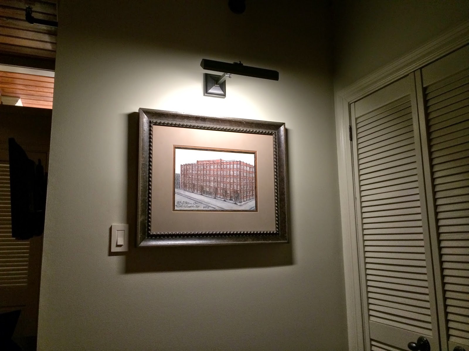
I was commissioned by my Uncle to do a charcoal rendering of his New Orleans condominium building. I was super excited at the chance to do this because I have hardly worked on hand drawings in the last couple years.
He sent me a couple photos he took from his phone:
He sent me a couple photos he took from his phone:
This is the Federal Fibre Mills Warehouse located 1107 S. Peters St., New Iberia, Louisiana. It it a beautiful structural brick building, and I found out some pretty interesting thing doing some research into it's history. It was designed in 1904 by Favrot and Livaudals and was constructed in 1907. In 1984 it was used as a pavilion for the World's Fair. It was then converted into condominiums in 1985. This was the main project that officially launched the warehouse district into the area it is today. It is also on the National Register for Historic Places.
After getting a feel for the building's past I got started on the rendering:
I choose watercolor paper. I used it because of its heavy weight and its texture could give some additional dimension.
I started by taping off the area I want to work within. He gave me the dimension of 15-1/2 inches by 11-1/2 inches, so it would be the same size as some of the other artwork he had already choosen.
Next I used vine charcoal and a ruler to do a basic layout of the area. I made sure my vanishing points were right. I choose a perspective looking down the street, which gives the building more character than a front view.
Then, I added more detail with the vine charcoal.
Next, I picked up some black conte' and started retracing lines and adding more detail.
Here you can see my work area with all my tools. I work the best in natural light and kneeling on the floor over my drawing.
Then, I wanted to add some color to give more life to the building. So, I picked up some siena conte' and started adding texture to the brick.
Next, I used white conte and more black conte to give some highlights and shadows.
It made me so happy when I peeled back the tape to reveal the crisp line underneath.
I added the street address, architects' names, and the year is was build next to my signature. For the font, I took inspirtaion from Jellyka Saint Andrews Queen.


LOOKS AMAZING! WOW!
ReplyDeleteThanks! It was a lot of fun to pick up charcoal again!
DeleteGreat job, Ashley!
ReplyDeleteSometimes I am critical of my own work, so thanks!
Delete